How to present numerical information so that the viewer easily understands the data? What is the best way to present data, in a graph or a table? Both can be a good choice, I always look for the most logical and clear way. Here, instead of a theoretical explanation, I prefer to show clear examples.
When the information is merely presented as a schematical concept, you find examples under concepts .
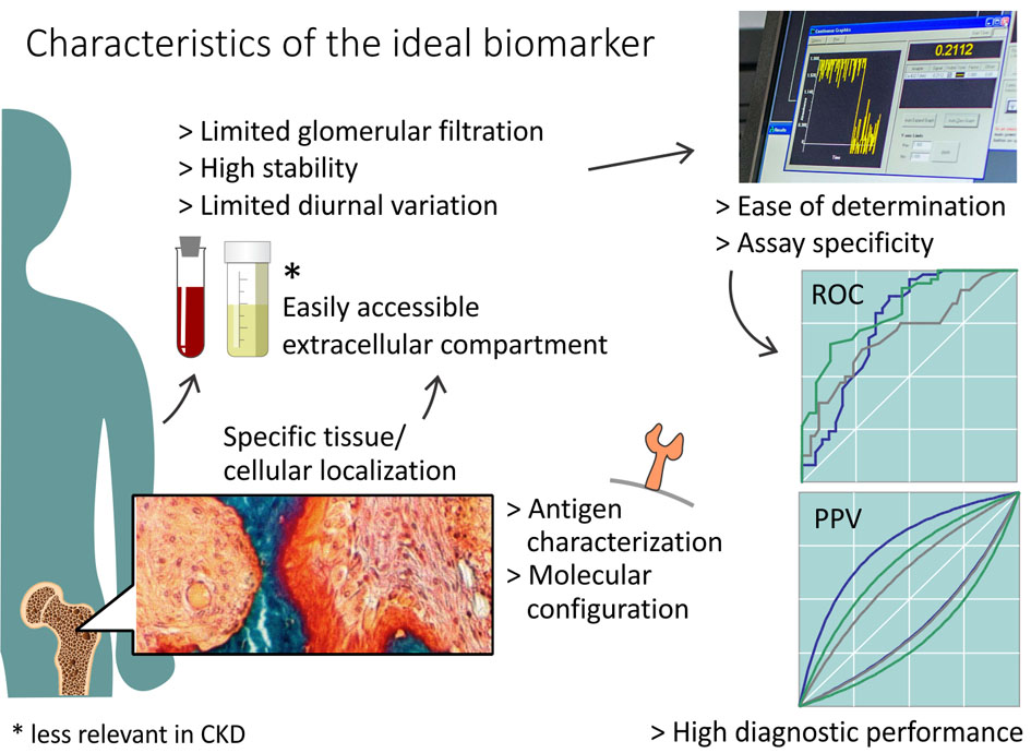
Here you find some principles of good visual representation.
For quantitative data (figures) I first look for a good graph, the most visual way of presenting, although some datasets present better in a table. Qualitative data (text) can only be structured in a table. All choices are made in close consultation with the client.
In a complex set of data a well designed chart can at a glance show what is happening, as in this example:
A good graph shows the logic of the data in a honest, direct visual way. In a correct chart all elements are found on the right spot, unambiguous and well legible. A good graph is compact, typographically consistent, has the right proportions and harmonious colors. Each finished graph can be reproduced with different data.
I can provide the same chart in two versions: a color version for your presentations, posters, ... and a monochrome version for publication in black and white. The graph is finished as a fully editable vector drawing, and from there exported to formats like eps, tif, png, ...
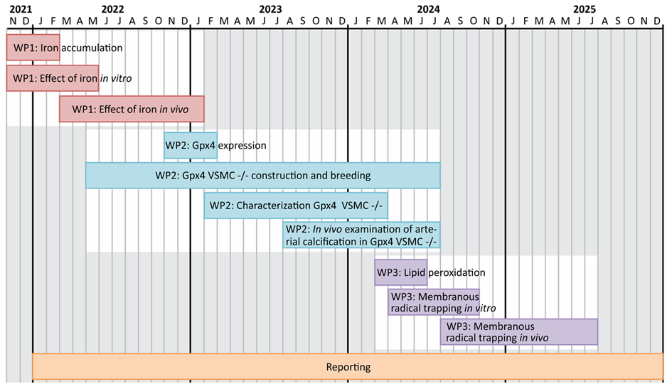
Planning of a project over four years
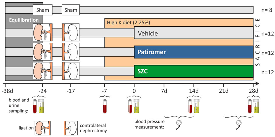
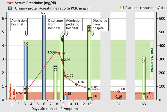
Setup of an animal study showing interventions, measurements and sampling
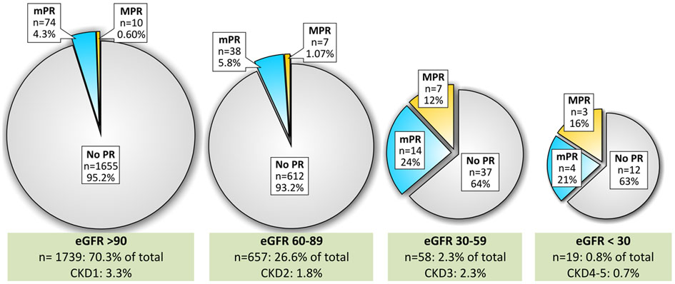
Pie charts
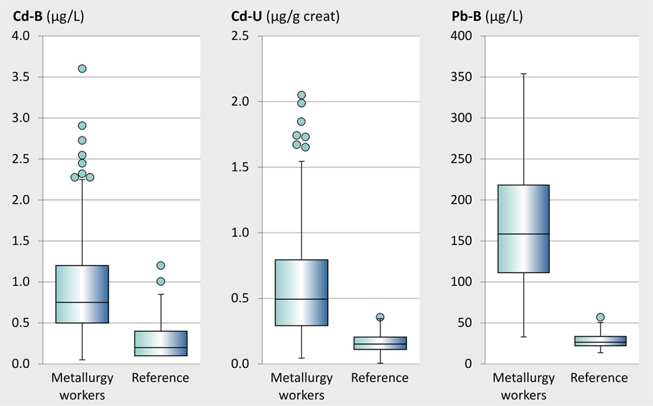
Box plots clearly show the distribution of a set of values
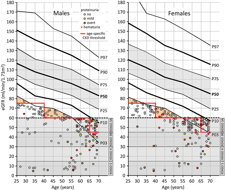
Graphs can present complex data: the lines show the evolution of filtration capacity of the kidney with age in males and females; the bullets are individuals; you see the severity of their kidney failure; the bullet color indicates proteinuria.
VISUAL ABSTRACT: combination of graphs, schemes, photos and text: a visual summary of a publication
Although tables tend to be less exciting to watch than graphs, for many data they remain the most efficient way of presenting. In the first place, a table must be logically built. The structure of titles, groups and features should clearly come forward from the rows and columns with a minimal use of lines and color. Normally, cases should be in rows and descriptions or parameters in columns: so the reader can compare consecutive values one below the other, which is better than side by side.
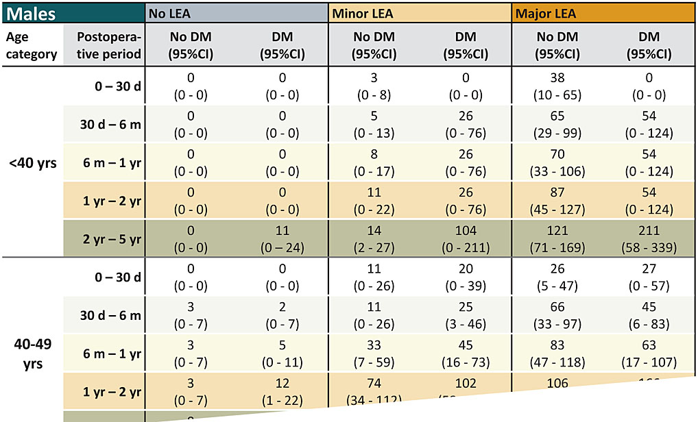
A clear view on a complex set of data kan be oobtained by the right layout and the use of border lines and color.
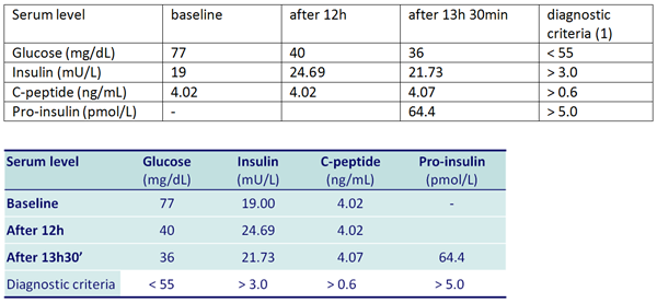
The table above is greatly improved by transposing (exchange of rows and columns, below)
Table-like presentations of data that actually are drawn in vector sotware can be quiet effective: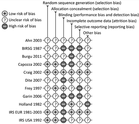
Judgement of methodological quality of patient studies