Layout of conference posters is an art. What appears at poster sessions usually doesn't come with an attractive and original layout, on the contrary, such collection of posters looks often extremely boring. A poster with a fresh look can really stand out and get attention. After nearly 30 years of making posters I know the tricks of the trade. Most posters suffer from a surfeit of data, which is detrimental for such a volatile medium. Drop that heavy table, that long block of text or complex figure, and stick to the essence of your message. A visually appropriate eyecatcher can do miracles. I create an original arrangement of text and illustrations in a balanced composition, with a splash of color here and there. Each poster has its own, unique layout.
Correlatie tussen bio-elektrische impedantie-analyse en spierechografie van de biceps brachii bij gezonde personen (atypical layout, use of color)
When mother nature takes your breath away
(alignment, use of color, asymmetry)
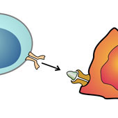
Concurrent chemoradiation or radiotherapy with anti-EGFR directed monoclonal antibody or CCRT + anti-EGFR in locoregionally advanced squamous cell carcinoma of the head and neck: a comprehensive review of randomized data
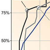
(how to present a large table)
A curious case of thoracal pain
( with a remarkable eye-catcher)
Copingvaardigheden bij jonge meisjes met anorexia nervosa: de eerste resultaten van een Vlaamse studie
(alignment, use of color)